Graphic concept
We would like to present a graphic concept for the General Conference ICOM Prague 2022.
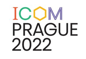
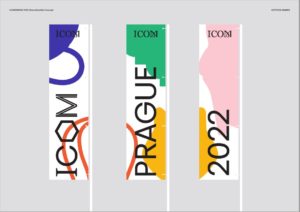
For the needs of visual communication, a unique conference logo was created, which hides many meanings. You can assign a specific meaning to each letter.
“I” refers to the ICOM logo, which is used worldwide,this letter that connects the long line of ICOM’s existence and the unique moment of the General Conference.
“C” is a reference to the present.
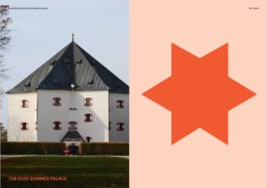
“O” can be read as a reference to the unique Czech cubism, the floor plan of the Hvězda summer house, or the shape of the benzene core (yes, our museums also deal with chemistry 😊).
“M” refers to mobility, which is an important part of the museum’s existence, it marks the paths that our visitors follow to us, just like us, when we meet each other at professional events such as the ICOM general conference.
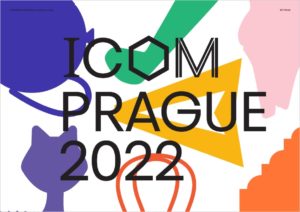
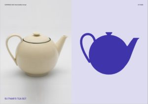
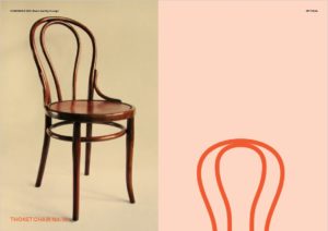
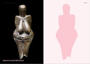
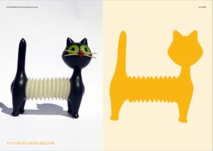
However, we did not limit the graphic concept to the logo only, but we wanted to present the most important thing that museums take care of – collection items. The iconic shapes of the Venus of Věstonice, Thonet or Cubist chairs, Libuše Niklová’s whistling cat, Sokol planes and other objects were converted into colored silhouettes, which will be composed according to current needs. Museums from all over the world will get acquainted with the shapes of unique objects from our collections and, while attending the general conference in Prague in 2022, they will see real objects.
The author of the graphic concept is the COLMO studio.
We discussed the graphic concept with the staff of the General Secretariat of ICOM and it was approved by the members of the ICOM Bureau, who evaluated it very positively, as progressive, helpful, playful, easy to remember, very museum.
You can view the entire graphic concept HERE.
We hope that you will like the logo and the entire visual concept as we do.
Have a nice day.
ICOM Czech republic Board
